
A driver is travelling at 110 kilometres per hour and wants to warm the seat, raise the cabin temperature by two degrees and start the windscreen defroster. The road remains the primary task. The controls are secondary, yet the way they are built decides how much of the driver’s vision the secondary task consumes.
In 2022, the Swedish motoring magazine Vi Bilägare documented this task, along with tuning the radio, resetting the trip computer and changing the instrument lighting, in twelve cars. Drivers were allowed to learn each interface before the timed runs. The result was not a universal verdict on every screen and every button. It was a useful observation of one ordinary capability: operating a familiar control while keeping attention available for motion outside the car.
The mechanical button matters here without being sacred. A well-designed physical control can turn a repeated action into a spatial and tactile skill. A screen can make the same action configurable, but it often asks the eyes to confirm where the control is, which state the interface is in and whether the touch registered. The question is not analogue versus digital. It is which human sense a design recruits when vision is already busy.
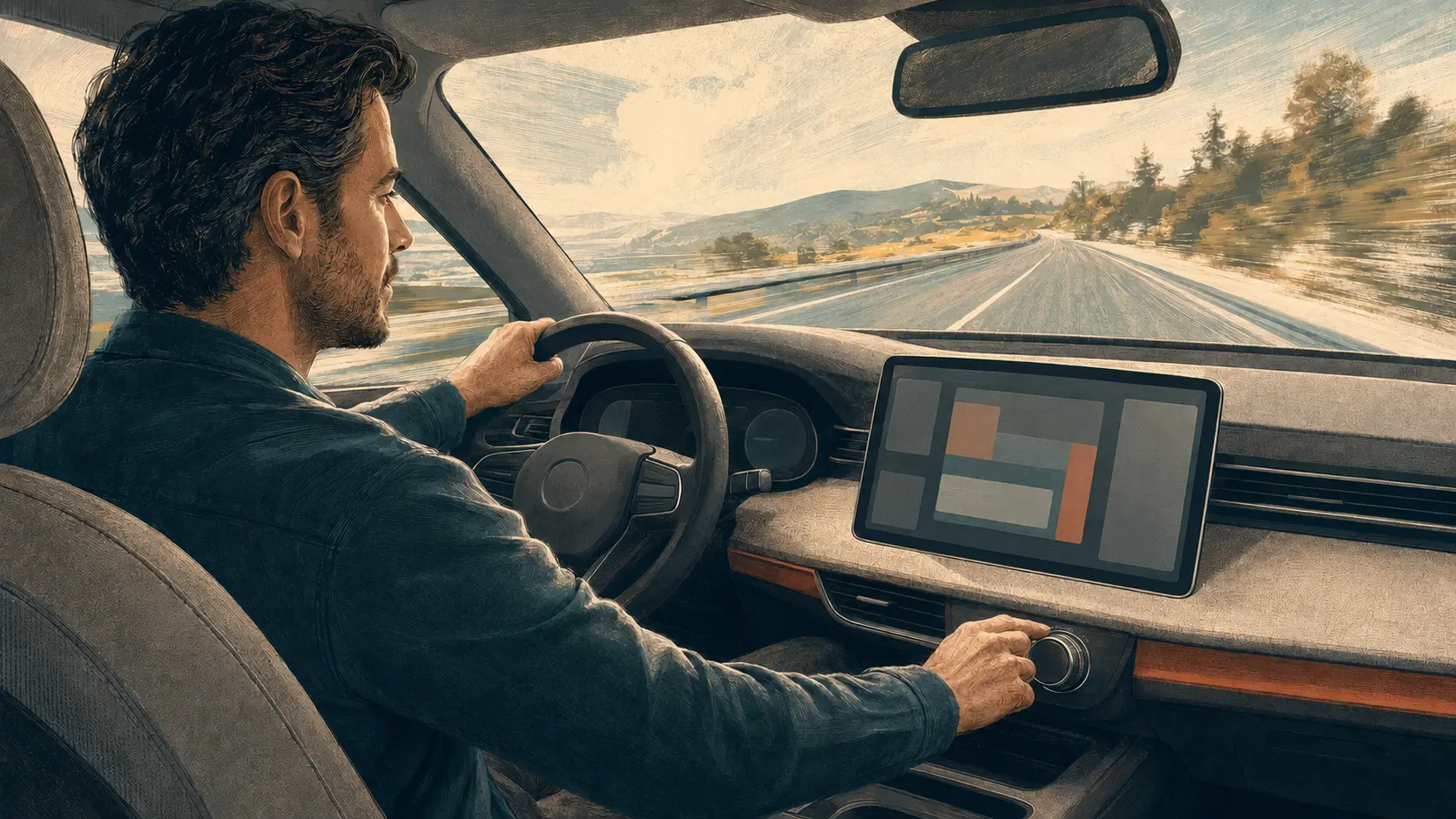
What the test actually showed
The 2005 Volvo V70 in the magazine’s comparison used conventional controls and completed all four task groups in 10 seconds, travelling 306 metres. The slowest result, in an MG Marvel R, was 44.9 seconds and 1,372 metres. Some contemporary cars with touchscreens performed much better than others: the Dacia Sandero and Volvo C40 were close to 14 seconds. That variation matters. A touchscreen is not automatically difficult, and a panel full of buttons is not automatically coherent.
The strongest lesson sits below the headline result. Physical controls can offer a fixed location, a distinct shape and resistance that confirms movement. Once learned, a hand can find a dial by position and recognise it by touch. The driver may still glance down, but the control itself can be located and adjusted without continuously reading it. A flat glass panel usually provides fewer physical landmarks. Its target can move after an update, disappear behind a menu or change function with the current screen. The finger lands, but confirmation is often visual.
This is why latency matters even when it is short. A mechanical click couples action and feedback. With a screen, delay between touch, animation and response can prompt a second tap or another look. A menu adds a different delay: not merely time, but a decision about where the desired function now lives. At speed, each small uncertainty competes with the road.
The button is a bundle of capabilities
The physical control’s advantage is not its material. It is the bundle of properties that material can provide: persistent position, tactile boundaries, operation through motion and immediate feedback. Euro NCAP’s 2026 driver-engagement protocol defines direct physical input in similar functional terms. It expects mechanical movement, discoverability by touch with little or no off-road gaze, and haptic feedback. It also explicitly considers whether alternatives work with cold, dry, wet or calloused fingers and with non-conductive gloves.
Those details broaden the issue beyond driving. Motion makes small touch targets harder to acquire. Gloves remove the skin contact that some capacitive controls require. Visual impairment can make a fixed tactile landmark essential. Yet physical controls can exclude too: a stiff knob may be painful, a small switch may demand fine dexterity, and a crowded console may be impossible to interpret. Screens can enlarge targets, change contrast, support multiple languages and let people customise frequent actions. Voice can provide another route when it works reliably and does not expose a private request to passengers or a remote service.
Human-centred design therefore needs redundancy rather than a winner. A persistent physical control may be the best primary route for a frequent, time-sensitive function. A screen may remain valuable for setup, detail and customisation. Voice may be useful as an alternative, not an alibi for burying the manual path.
Why screens keep absorbing controls
A central display can replace many separate parts, reuse software across models and change after manufacture. It gives designers a clean surface and manufacturers a route to add features without rebuilding the dashboard. Those are real advantages. They also create an incentive to treat every control as equally suitable for software, even though setting a rarely used preference is not the same task as clearing a misted windscreen in motion.
The failure modes reveal the difference. A worn button may become sticky or fail locally, and a modular switch can sometimes be replaced. A central display failure can remove navigation, climate access and vehicle settings together. Conversely, a mechanical panel has more separate components and cannot gain a new layout through an update. Neither architecture guarantees repairability: manufacturers can integrate a button bank into an expensive module, just as they can make a display replaceable. Repair is a design and support decision, not an inherent virtue of knobs.
Updates deserve particular scrutiny because they can alter a learned map. Customisation may help a driver put a favourite control within reach, but it can also make the interface different from the next car or from the state a passenger expects. For functions used under pressure, consistency is itself a safety feature.
What this field note cannot prove
The Vi Bilägare comparison was a magazine test, not a peer-reviewed experiment. It used one task set, a small collection of vehicles and cars from very different design eras. Familiarisation reduces one source of bias but does not equal months of ownership. The total time combines several actions, so it cannot isolate the effect of a single temperature dial. It also did not test voice control. The large gap is evidence of an interface problem in those documented cars, not a law that every physical control beats every screen.
There is nevertheless a sound standard for judging the mechanism. The US National Highway Traffic Safety Administration’s voluntary visual-manual guidelines use eye-glance tests and recommend that unsuitable secondary tasks be unavailable while driving. Its acceptance criteria include no individual off-road glance longer than two seconds and no more than 12 seconds of total eyes-off-road time for a task. Euro NCAP now assesses the placement and interaction mode of controls, including climate and infotainment functions. Both approaches turn “easy to use” into something that can be observed rather than advertised.
The last mechanical button should not be preserved because it reminds us of older machines. It should remain wherever its tactile persistence protects a capability that a programmable surface cannot yet match: acting accurately while attention stays on something more important.
If you value careful writing about technology and human agency, subscribe to Alkemata for future field notes and explainers.
Continue exploring
This question extends beyond cars. Every Smart Device Needs a Real Manual Mode examines why essential local control should survive an app, account or cloud failure. The remaining design decision is more precise: which actions are frequent, urgent or safety-related enough to deserve a stable physical path before the screen is allowed to absorb them?
Author
What concrete example would confirm or challenge this article?
Choose a reaction, write a comment, or ask your AI assistant to send a proposal for review. Comments are reviewed before publication.